Design System
UX Design and Product Owner
More cohesive UX, faster development & team alignment
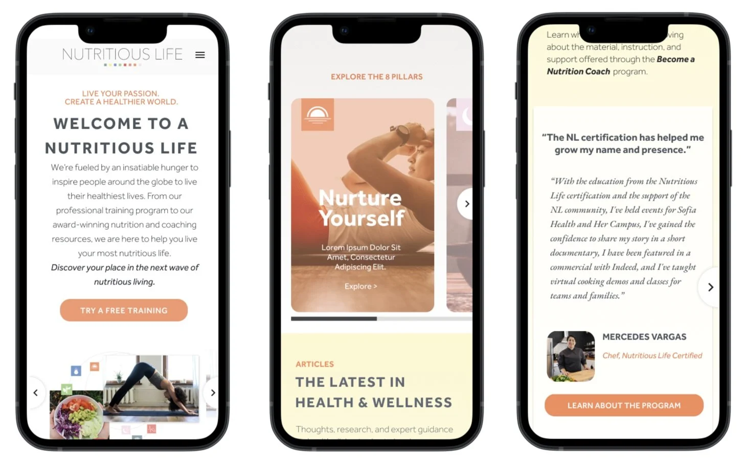
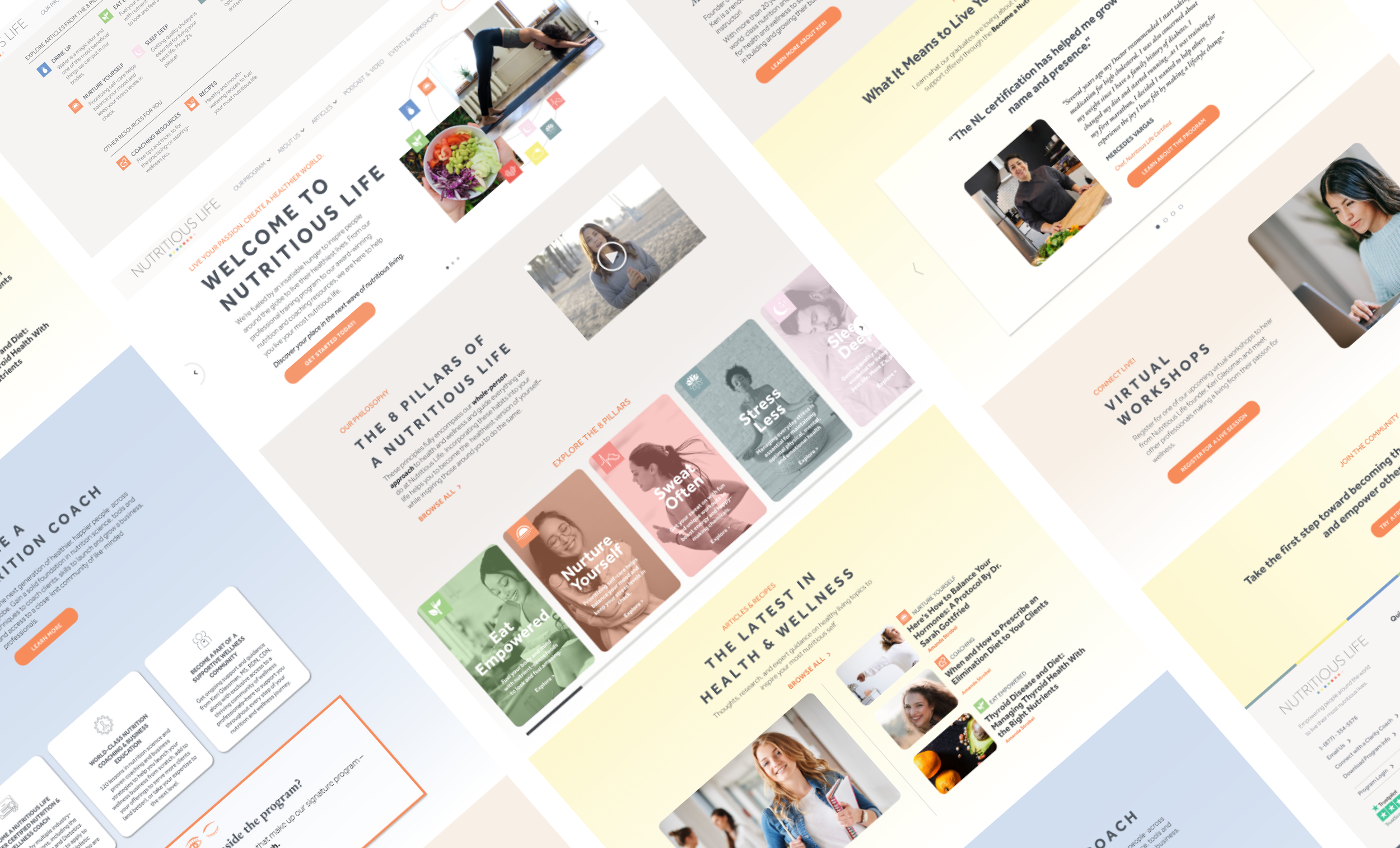
This Modular Design System was developed to support multiple brands under the Empowered Education umbrella. Efficient design and development, consistent user experience, and scalable creation of websites and landing pages were core outcomes.

Systemic, Scalable Website Redesigns for Multi-brands and a Growing Portfolio
Empowered Education (EE) is a house of Online Education brands dedicated to training coaches and clinicians in the Health and Wellness industry.
EE needed to redesign the websites of two of their existing brands and it needed to be done in a modular way so that the website redesigns and future site redesigns could be done efficiently, consistently, and with future acquisitions and scaling in mind.
Additionally, we wanted to create a streamlined way to create future landing pages, campaign funnels, and program launches - with efficiency and brand integrity in mind.
What I did
I partnered with another designer and the development team to create a design system in Figma, and implemented in Wordpress.
I also led the UX Design for the Functional Nutrition Alliance brand, which required combining two separate sites into one more cohesive brand experience.
-
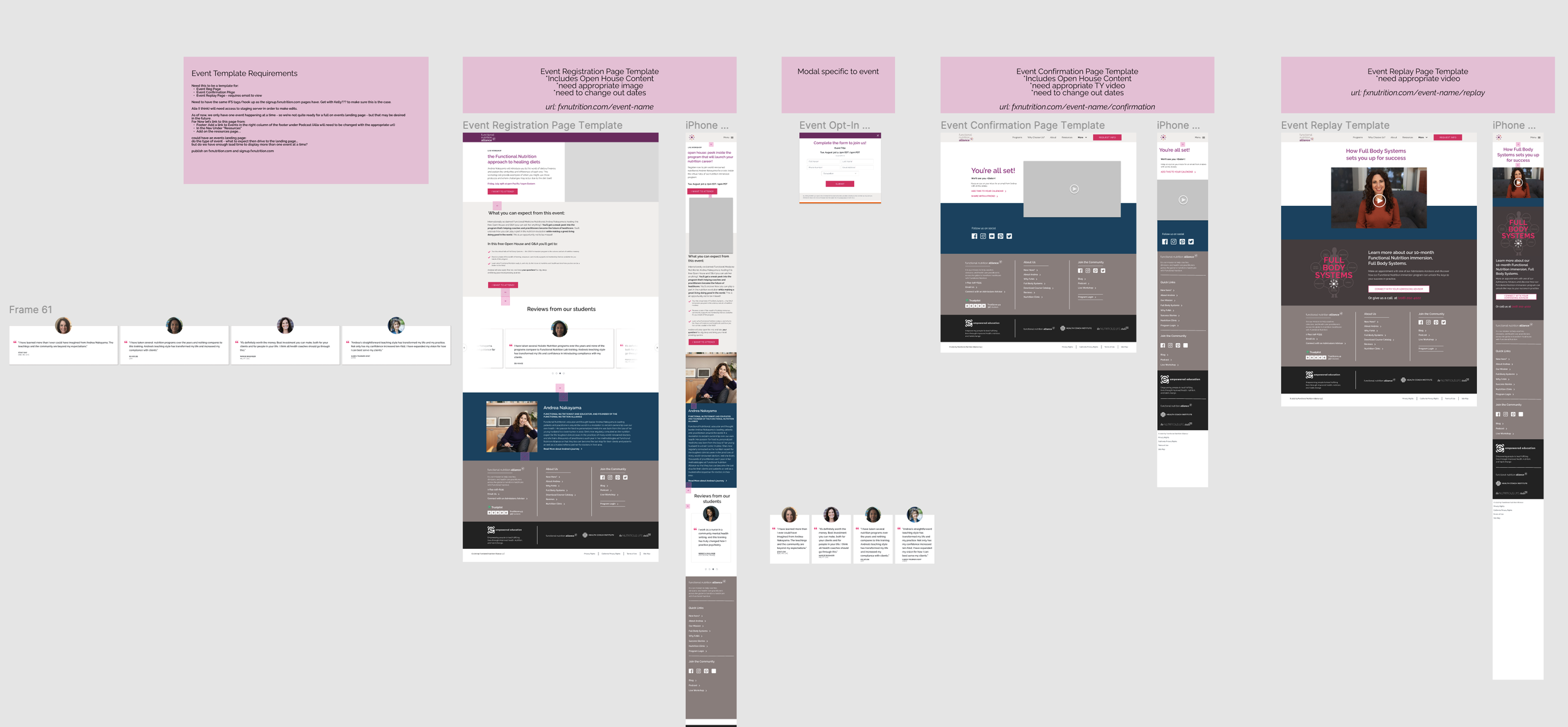
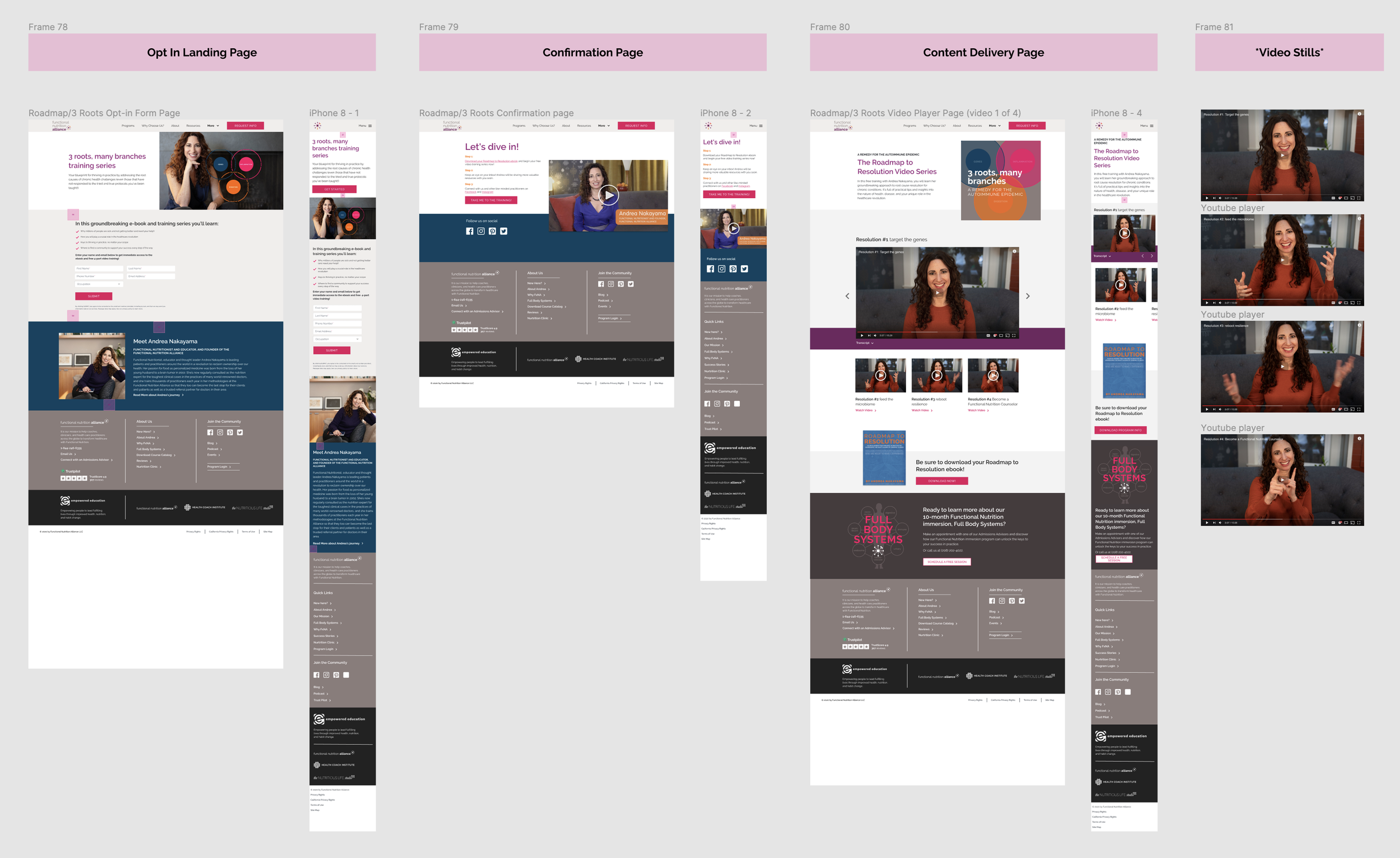
I worked with the development team and project management to define MVP features, pages, and modular design needs. This included templates for funnels and event flows that were necessary to keep marketing systems in place and in flow.
-
To keep key stakeholders and teams in the loop and invested in the Design System and redesign process, I led workshops to showcase page designs, funnel interactions, and Design System libraries and capabilities. This system of communication built confidence and trust in the work.
-
This included:
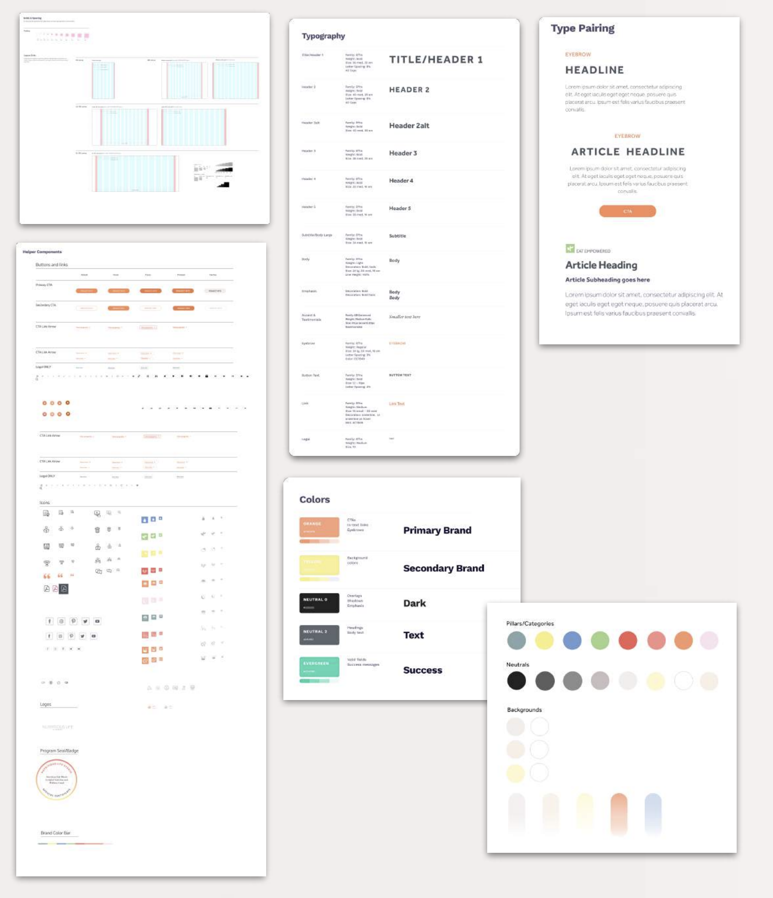
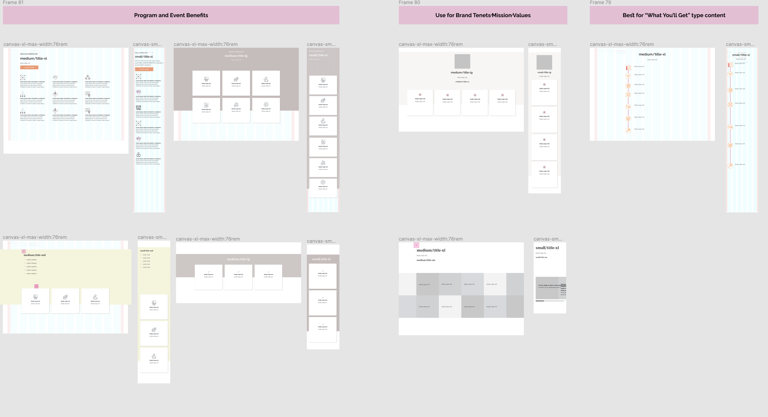
Library of Design Tokens and guidance for use
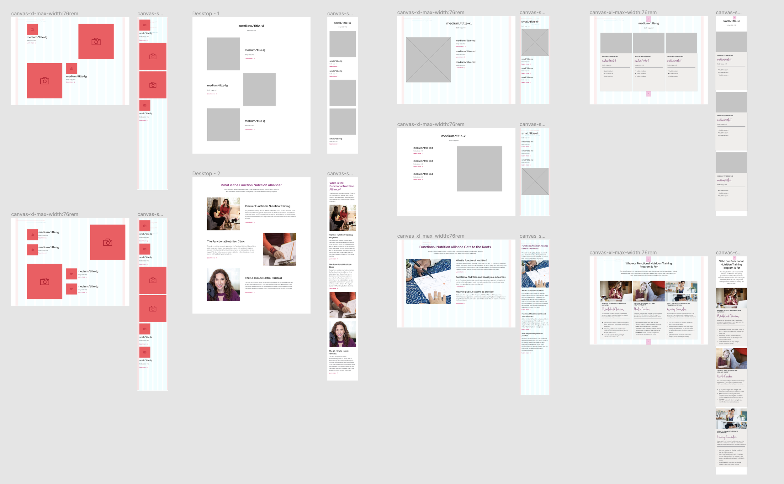
Library of flexible modules for key content needs such as page headers, short-from content, curriculum details, instructor bios, reviews, benefits, and long-form content.
Templatized collection of website pages, sales pages, article and podcast pages, SEM landing pages, and funnel experiences designed with branded elements, and reuse in mind.
-
QA for this project was a biggie. Two separate site redesigns, with hundreds of articles and podcasts, multiple funnels, and complete redesigns and rewrites of all pages - there was a lot to review to ensure we launched with excellence.
-
I led efforts to capture Phase 2 design and development needs, as well as maintain and evolve the design systems as required.

Using the design system to quell leadership anxieties about using a design system 😉
This was the first major re-design effort done in this organization, and certainly the first systemic approach to design and development.
This caused some anxieties among broader members of the organization - and a common concern from the C-Suite brand was that the brand identity would be lost and distinct brands would look too similar by taking a systems design approach.
To address these concerns - we used the design system. I facilitated group workshops where I could showcase the capabilities and inherent flexibilities of the design system in real-time. I was able to show how seamlessly we could change the look and feel of a page or a funnel to ensure brand identity remained strong, and identify ways to make it stronger.
Key stakeholders loved the flexibility and the opportunities for accelerated internal communication. These workshop experiences even got leadership advocating for the Design System which was a major boon for the project!
Core Outcomes
Faster Development, Cohesive User Experience, Scalable Systems Design, and Better Performing Websites
The Design System has afforded design and development teams the ability to:
Work within existing constraints to help to speed up design and development, and allow for more accurate project scoping.
Give the organization a framework that they can continue to expand and evolve as needed.
Provided a much-needed communication tool that allows for more seamless stakeholder alignment, design reviews, and design-to-development handoffs.
Allowed for the same team of designers and developers to double (and eventually quadruple) their workload, without increasing headcount.
Design system outcomes:
More seamless brand experience across the digital ecosystem: websites, social, email communications, webinars, program materials - etc.
The two sites that were redesigned as the design system was created experienced
Increased organic traffic to sites, 111% and 228%
Increased conversion rates by 35% and 33%


